
Show code cell source
import numpy as np
import seaborn as sns
import pandas as pd
import matplotlib.pyplot as plt

from matplotlib import cm

from sklearn import datasets
from sklearn.datasets import make_blobs

from mpl_toolkits.mplot3d import Axes3D
import scipy.ndimage

import warnings
warnings.filterwarnings("ignore", category=FutureWarning)

pd.set_option("display.max_rows", None)
Motivación: visualizar datos multidimensionales#
Clasificación y clustering#
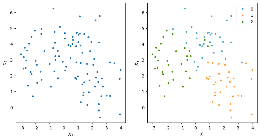
Datos bidimensionales con etiquetas
Show code cell source
X, y = make_blobs(n_samples=100, centers=3, n_features=2,random_state=0)
#np.unique(y)
df1 = pd.DataFrame(X,columns=['x1','x2'])
df1['label'] = y
df1.head(10)
| x1 | x2 | label | |
|---|---|---|---|
| 0 | 2.631858 | 0.689365 | 1 |
| 1 | 0.080804 | 4.690690 | 0 |
| 2 | 3.002519 | 0.742654 | 1 |
| 3 | -0.637628 | 4.091047 | 0 |
| 4 | -0.072283 | 2.883769 | 0 |
| 5 | 0.628358 | 4.460136 | 0 |
| 6 | -2.674373 | 2.480062 | 2 |
| 7 | -0.577483 | 3.005434 | 2 |
| 8 | 2.727562 | 1.305125 | 1 |
| 9 | 0.341948 | 3.941046 | 0 |
Show code cell source
f,axes = plt.subplots(nrows=1,ncols=2,figsize=(10,5))
ax = axes.ravel()
ax[0].plot(X[:,0],X[:,1],'.')

colors = ["#4EACC5", "#FF9C34", "#4E9A06"]
for yy in np.unique(y):
    dataSelection = y ==yy
    data = X[dataSelection,:]
    ax[1].plot(data[:,0],data[:,1],'.',c=colors[yy],label=yy)
ax[1].legend()
for a in ax:
    a.set_xlabel(r'$X_1$')
    a.set_ylabel(r'$X_2$')
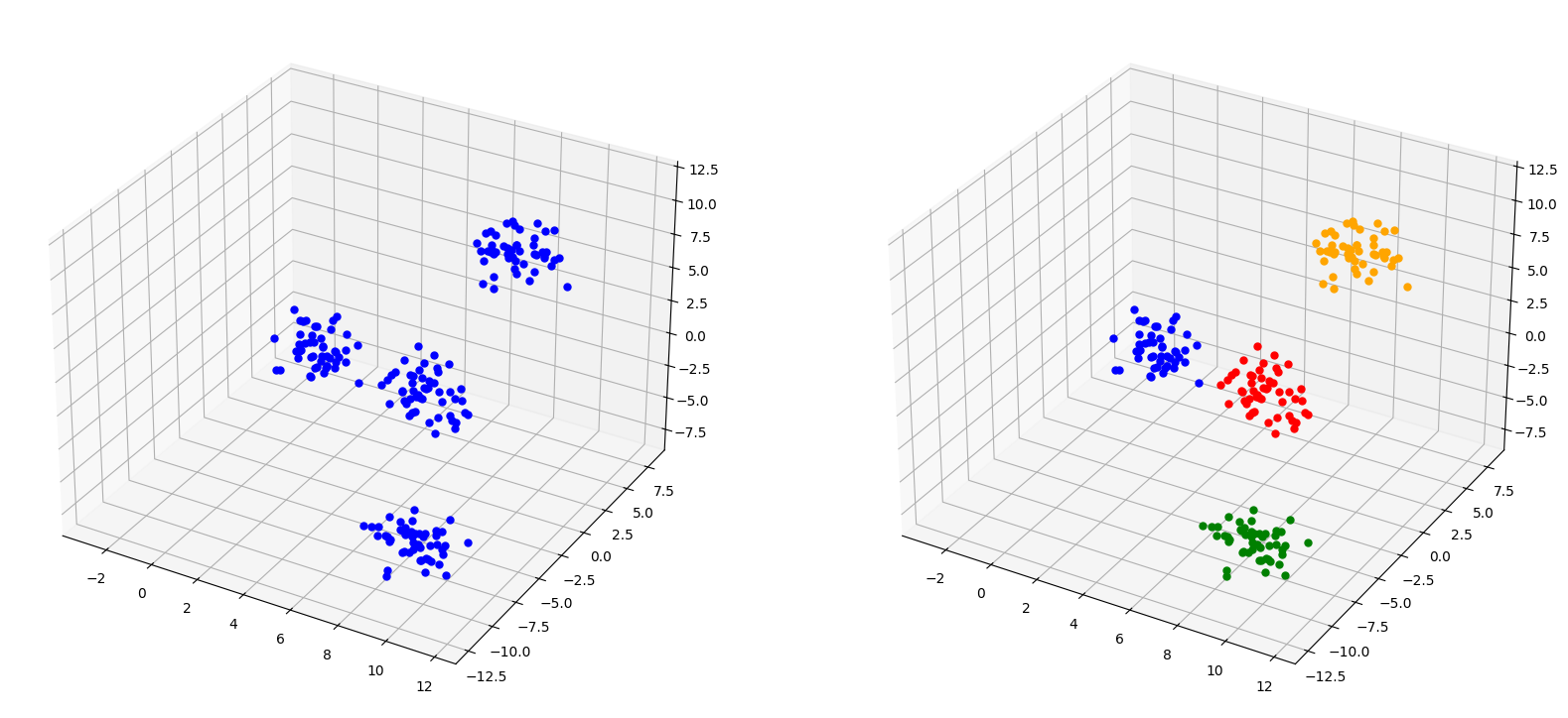
Datos tridimensionales con etiquetas
Show code cell source
X, y = make_blobs(n_samples=200, centers=4, n_features=3,random_state=4)
#np.unique(y)
df1 = pd.DataFrame(X,columns=['x1','x2','x3'])
df1['label'] = y
df1.head()
| x1 | x2 | x3 | label | |
|---|---|---|---|---|
| 0 | 9.863844 | 0.448826 | 9.282223 | 0 |
| 1 | 10.596115 | -11.280679 | -5.449909 | 2 |
| 2 | -2.083092 | 7.565793 | -5.662472 | 3 |
| 3 | 5.578687 | 5.149093 | -6.176931 | 1 |
| 4 | 4.101746 | 3.373981 | -6.774126 | 1 |
Show code cell source
colorsDict = {0:'orange',
              1:'red',
              2:'green',
              3:'blue'}

fig = plt.figure(figsize=(20,10))
ax = fig.add_subplot(121, projection='3d')
for ii in df1.index:
    ax.scatter(
        df1.loc[ii,'x1'],
        df1.loc[ii,'x2'],
        df1.loc[ii,'x3'],
        marker='.',
        s=100,
        color='blue'
        #color = colorsDict[
        #    df1.loc[ii,'label']
        #]
    )
ax = fig.add_subplot(122, projection='3d')
for ii in df1.index:
    ax.scatter(
        df1.loc[ii,'x1'],
        df1.loc[ii,'x2'],
        df1.loc[ii,'x3'],
        marker='.',
        s=100,
        color = colorsDict[
            df1.loc[ii,'label']
        ]
    )
plt.show()
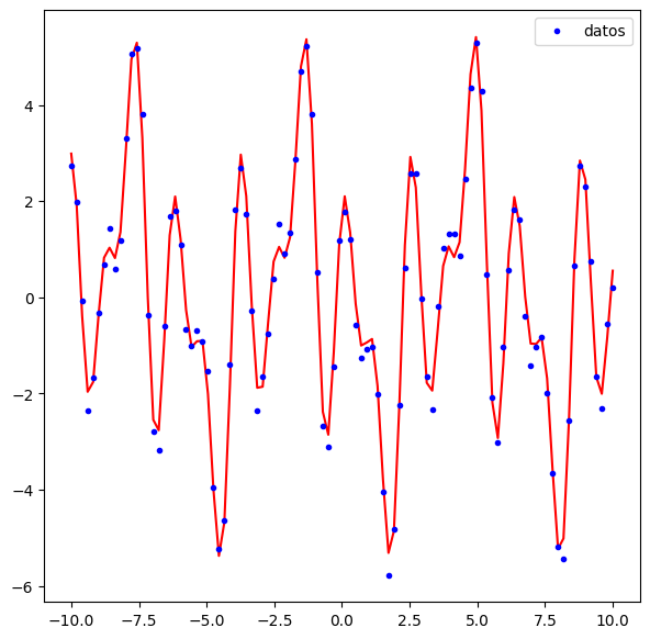
Regresión#
Show code cell source
x = np.linspace(-10,10,100)
y = 4*np.sin(x)*np.cos(2*x)+np.sin(3*x)/3+11/6*np.cos(5*x)
f,ax = plt.subplots(nrows=1,ncols=1,figsize=(7,7))
ax.plot(x,y,'-',color='red')
ydata = y+np.random.uniform(-0.5,0.5,y.shape[0])
ax.plot(x,ydata,'.',color='blue',label='datos')
ax.legend()
<matplotlib.legend.Legend at 0x199c5e86fd0>
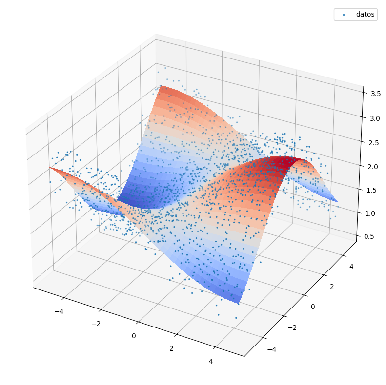
Show code cell source
fig, ax = plt.subplots(figsize=(10,10),subplot_kw={"projection": "3d"})
# Make data.
X = np.arange(-5, 5, 0.25)
Y = np.arange(-5, 5, 0.25)
X, Y = np.meshgrid(X, Y)
#R = np.sqrt(X**2 + Y**2)
#Z = np.sin(R)
Z=np.sin(X/3)*np.cos(Y/2)+2
Z2 = np.sin(X/3)*np.cos(Y/2)+2+np.random.uniform(-0.5,0.5,(Z.shape[0],Z.shape[1]))

# Plot the surface.
surf = ax.plot_surface(X, Y, Z, cmap=cm.coolwarm,
                       linewidth=0, antialiased=False)
ax.scatter(X,Y,Z2,s=2,label='datos')
ax.legend()
plt.show()
Más de tres dimensiones#
Cuando tenemos más dimensiones no podemos visualizar los datos.
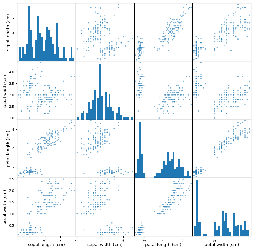
Datos iris
Usamos la scatter_matrix
Show code cell source
# iris
iris = datasets.load_iris()
iris_data = iris.data
iris_data.shape
irisDf = pd.DataFrame(iris_data,columns=iris.feature_names)
irisDf['target'] = iris.target
irisDf.head()
| sepal length (cm) | sepal width (cm) | petal length (cm) | petal width (cm) | target | |
|---|---|---|---|---|---|
| 0 | 5.1 | 3.5 | 1.4 | 0.2 | 0 |
| 1 | 4.9 | 3.0 | 1.4 | 0.2 | 0 |
| 2 | 4.7 | 3.2 | 1.3 | 0.2 | 0 |
| 3 | 4.6 | 3.1 | 1.5 | 0.2 | 0 |
| 4 | 5.0 | 3.6 | 1.4 | 0.2 | 0 |
df = pd.DataFrame(iris.data, columns=iris.feature_names)
colors=np.array(50*['r']+50*['g']+50*['b'])
pd.plotting.scatter_matrix(df,
                           alpha=0.6,
                           figsize=(10,10),
                           #color=colors,
                           hist_kwds={'bins':30})
plt.show()
Show code cell source
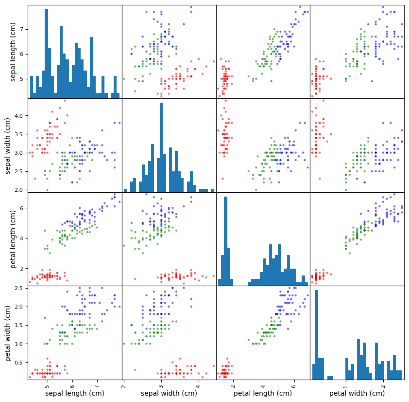
df = pd.DataFrame(iris.data, columns=iris.feature_names)
colors=np.array(50*['r']+50*['g']+50*['b'])
pd.plotting.scatter_matrix(df,
                           alpha=0.6,
                           figsize=(10,10),
                           color=colors,
                           hist_kwds={'bins':30})
plt.show()
Show code cell source
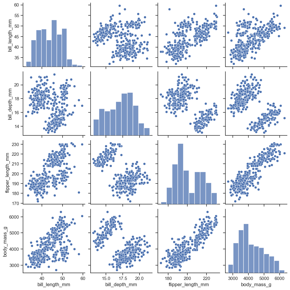
import seaborn as sns
sns.set_theme(style="ticks")

df = sns.load_dataset("penguins")
df.head(10)
| species | island | bill_length_mm | bill_depth_mm | flipper_length_mm | body_mass_g | sex | |
|---|---|---|---|---|---|---|---|
| 0 | Adelie | Torgersen | 39.1 | 18.7 | 181.0 | 3750.0 | Male |
| 1 | Adelie | Torgersen | 39.5 | 17.4 | 186.0 | 3800.0 | Female |
| 2 | Adelie | Torgersen | 40.3 | 18.0 | 195.0 | 3250.0 | Female |
| 3 | Adelie | Torgersen | NaN | NaN | NaN | NaN | NaN |
| 4 | Adelie | Torgersen | 36.7 | 19.3 | 193.0 | 3450.0 | Female |
| 5 | Adelie | Torgersen | 39.3 | 20.6 | 190.0 | 3650.0 | Male |
| 6 | Adelie | Torgersen | 38.9 | 17.8 | 181.0 | 3625.0 | Female |
| 7 | Adelie | Torgersen | 39.2 | 19.6 | 195.0 | 4675.0 | Male |
| 8 | Adelie | Torgersen | 34.1 | 18.1 | 193.0 | 3475.0 | NaN |
| 9 | Adelie | Torgersen | 42.0 | 20.2 | 190.0 | 4250.0 | NaN |
Método pairplot del paquete seaborn
https://seaborn.pydata.org/generated/seaborn.pairplot.html
sns.pairplot(df)
<seaborn.axisgrid.PairGrid at 0x199c172f770>
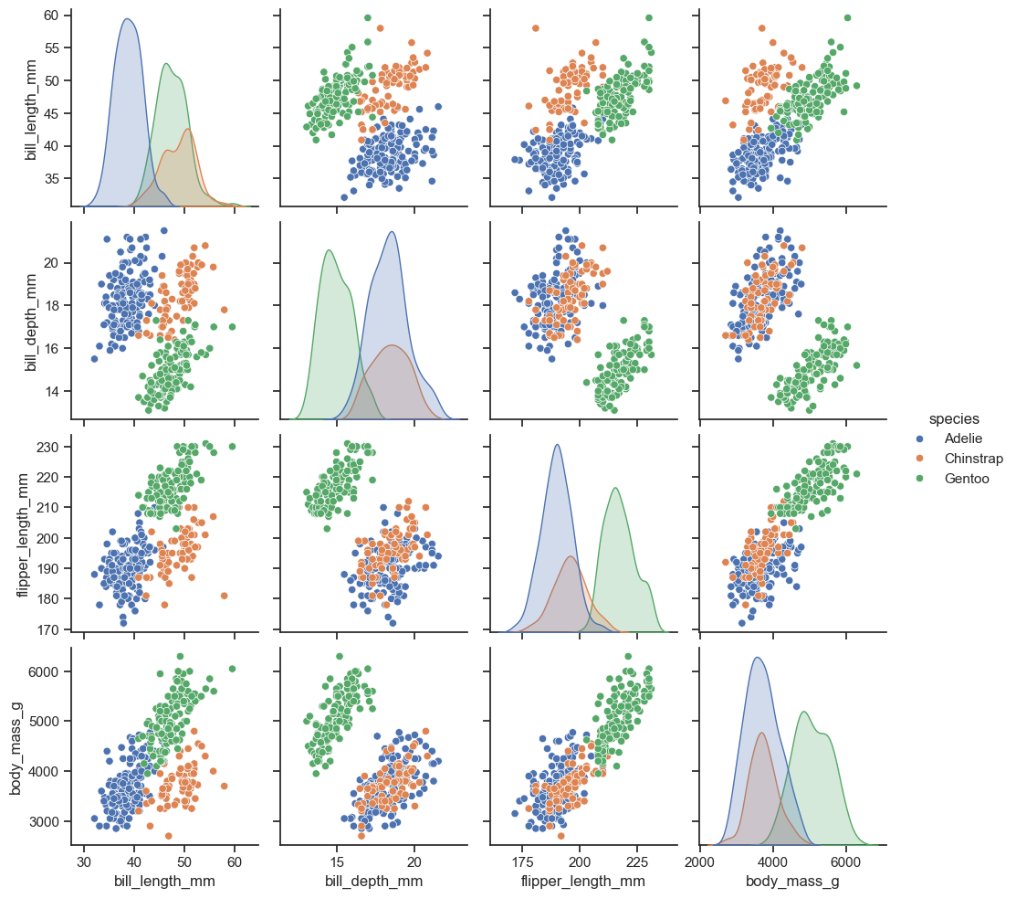
sns.pairplot(df, hue="species")
<seaborn.axisgrid.PairGrid at 0x199c73c6850>
Puede haber datos sin etiquetas
Show code cell source
import numpy as np
import pandas as pd

np.random.seed(134)
N = 1000

x1 = np.random.normal(0, 1, N)
x2 = x1 + np.random.normal(0, 3, N)
x3 = 2 * x1 - x2 +  np.random.normal(0, 2, N)
x4 = x3 * x1 -4*x2 + np.random.normal(0, 1, N)
x5 = x2-x4*x1 + np.random.normal(0, 2, N)

df = pd.DataFrame({'x1':x1,
                   'x2':x2,
                   'x3':x3,
                   'x4':x4,
                   'x5':x5
                  })

df.head()
| x1 | x2 | x3 | x4 | x5 | |
|---|---|---|---|---|---|
| 0 | -0.224315 | -8.840152 | 10.145993 | 33.286302 | -1.376902 |
| 1 | 1.337257 | 2.383882 | -1.854636 | -11.590022 | 18.471552 |
| 2 | 0.882366 | 3.544989 | -1.117054 | -14.303068 | 14.009670 |
| 3 | 0.295153 | -3.844863 | 3.634823 | 15.538617 | -4.391063 |
| 4 | 0.780587 | -0.465342 | 2.121288 | 2.874332 | 1.209348 |
Show code cell source
import matplotlib.pyplot as plt
pd.plotting.scatter_matrix(df,figsize=(10,10))
plt.show()
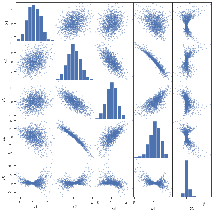
Proyecciones#
Las gráficas anteriores son proyecciones ortogonales de los datos sobre los diferentes planos formados eligiendo coordenadas de los diferentes atributos, por parejas
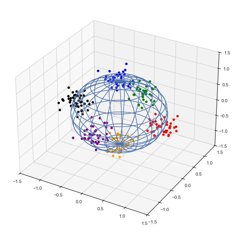
Ejemplo ad hoc en tres dimensiones
Show code cell source
clusters=[1,2,3,4,5,6]
Npuntos = 40*len(clusters)

dictClusters={1:(1,0,0),
              2:(0,1,0),
              3:(0,0,1),
             4:(-1,0,0),
             5:(0,-1,0),
             6:(0,0,-1)}

dictDesvests={1:0.15,
              2:0.15,
              3:0.15,
             4:0.15,
             5:0.15,
             6:0.15}


label = []
df = pd.DataFrame(columns = ['x1','x2','x3'])
for _ in range(Npuntos):
    cluN = np.random.choice(clusters)
    clu=dictClusters[cluN]
    clx,cly,clz = clu
    desvest = dictDesvests[cluN]
    clx += np.random.normal(0,desvest)
    cly += np.random.normal(0,desvest)
    clz += np.random.normal(0,desvest)
    label.append(cluN)
    df.loc[df.shape[0]] = [clx,cly,clz]
df['label'] = label
Show code cell source
df.head()
| x1 | x2 | x3 | label | |
|---|---|---|---|---|
| 0 | -1.017333 | 0.098265 | 0.038147 | 4 |
| 1 | -1.266728 | -0.147091 | 0.011565 | 4 |
| 2 | -1.010595 | -0.059136 | -0.128969 | 4 |
| 3 | 0.018001 | -1.076903 | 0.076536 | 5 |
| 4 | -0.088302 | -0.908741 | -0.319811 | 5 |
Show code cell source
colorsDict = {6:'orange',
              1:'red',
              2:'green',
              3:'blue',
             4:'black',
             5:'purple'}

#maxLabel = np.max(df.label.unique())

fig = plt.figure(figsize=(10,10))
ax = fig.add_subplot(111, projection='3d')


u = np.linspace(0, 2 * np.pi, 39)
v = np.linspace(0,np.pi, 21)

x = np.outer(np.cos(u), np.sin(v))
y = np.outer(np.sin(u), np.sin(v))
z = np.outer(np.ones(np.size(u)), np.cos(v))

## Use 3x the stride, no scipy zoom
#ax = fig.gca(projection='3d')
##ax.plot_surface(x, y, z, rstride=3, cstride=3, color='black', shade=0)
#ax.plot_wireframe(x, y, z,rstride=2,cstride=2)

#plt.show()

# Normalize to [0,1]
norm = plt.Normalize(z.min(), z.max())
colors = cm.viridis(norm(z))
rcount, ccount, _ = colors.shape

#fig = plt.figure()
ax.plot_wireframe(x, y, z,rstride=2,cstride=2)

#surf = ax.plot_surface(x, y, z, rcount=rcount, ccount=ccount,
#                       facecolors=colors, shade=False)


for ii in df.index:
    ax.scatter(
        df.loc[ii,'x1'],
        df.loc[ii,'x2'],
        df.loc[ii,'x3'],
        marker='.',
        s=100,
        color=colorsDict[df.loc[ii,'label']]
    )

ax.set_xlim((-1.5,1.5))
ax.set_ylim((-1.5,1.5))
ax.set_zlim((-1.5,1.5))

plt.show()
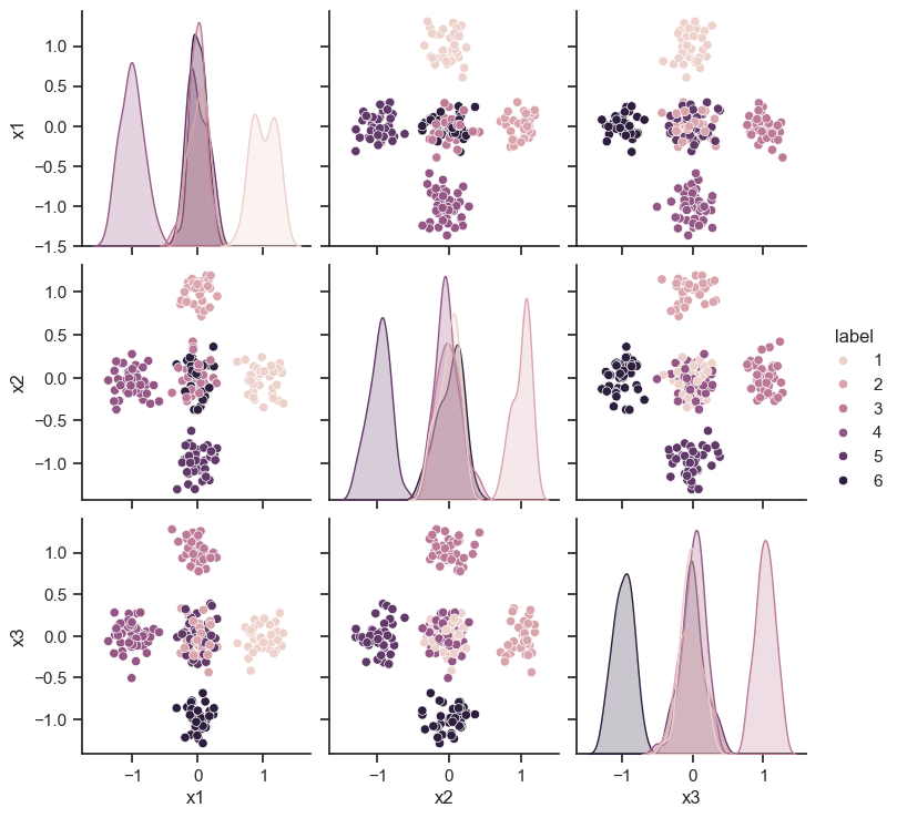
Show code cell source
sns.pairplot(df, hue="label")
<seaborn.axisgrid.PairGrid at 0x199c5d74050>
Show code cell source
colorsDict = {6:'orange',
              1:'red',
              2:'green',
              3:'blue',
             4:'black',
             5:'purple'}

#maxLabel = np.max(df.label.unique())

fig = plt.figure(figsize=(10,10))
ax = fig.add_subplot(111, projection='3d')


u = np.linspace(0, 2 * np.pi, 39)
v = np.linspace(0,np.pi, 21)

x = np.outer(np.cos(u), np.sin(v))
y = np.outer(np.sin(u), np.sin(v))
z = np.outer(np.ones(np.size(u)), np.cos(v))

## Use 3x the stride, no scipy zoom
#ax = fig.gca(projection='3d')
##ax.plot_surface(x, y, z, rstride=3, cstride=3, color='black', shade=0)
#ax.plot_wireframe(x, y, z,rstride=2,cstride=2)

#plt.show()

# Normalize to [0,1]
norm = plt.Normalize(z.min(), z.max())
colors = cm.viridis(norm(z))
rcount, ccount, _ = colors.shape

#fig = plt.figure()
ax.plot_wireframe(x, y, z,rstride=2,cstride=2)

#surf = ax.plot_surface(x, y, z, rcount=rcount, ccount=ccount,
#                       facecolors=colors, shade=False)


for ii in df.index:
    ax.scatter(
        df.loc[ii,'x1'],
        df.loc[ii,'x2'],
        df.loc[ii,'x3'],
        marker='.',
        s=100,
        color=colorsDict[df.loc[ii,'label']]
    )

# proyeccion 1
for ii in df.index:
    ax.scatter(
        -3,
        df.loc[ii,'x2'],
        df.loc[ii,'x3'],
        marker='.',
        s=100,
        color=colorsDict[df.loc[ii,'label']]
    )

# proyeccion 2
for ii in df.index:
    ax.scatter(
        df.loc[ii,'x1'],
        3,
        df.loc[ii,'x3'],
        marker='.',
        s=100,
        color=colorsDict[df.loc[ii,'label']]
    )

# proyeccion 2
for ii in df.index:
    ax.scatter(
        df.loc[ii,'x1'],
        df.loc[ii,'x2'],
        -3,
        marker='.',
        s=100,
        color=colorsDict[df.loc[ii,'label']]
    )

plt.show()
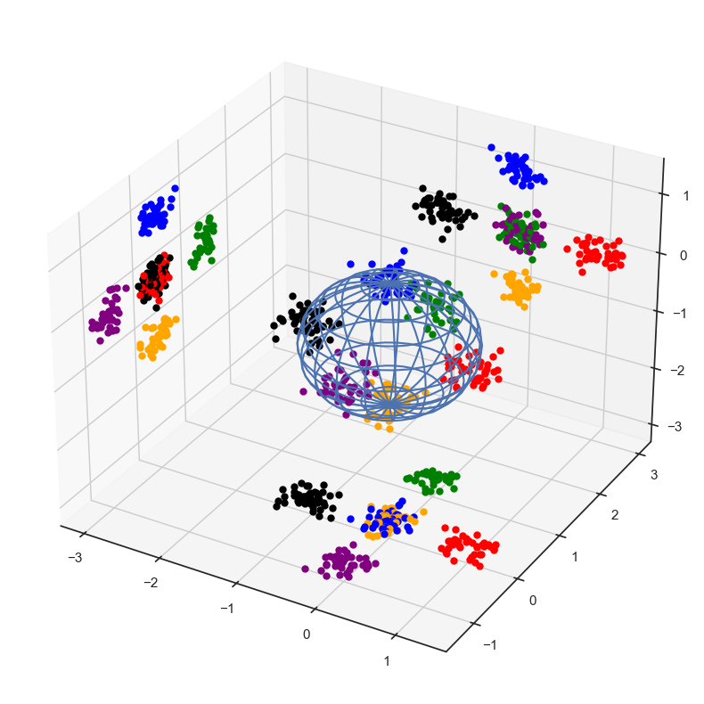
Ninguna proyección es completamente satisfactoria: problema con la distancia.
Nota: estas no son las únicas proyecciones posibles.Existen más proyecciones posibles
Recordatorio: proyección ortogonal en una recta
Ejemplo ad hoc en el plano
Show code cell source
c1 = np.array((1,1))
c2 = np.array((2,1))
c3 = np.array((1,2))
c4 = np.array((2,2))
centers = [c1,c2,c3,c4]
Npuntos = 20
df = pd.DataFrame(columns=['x1','x2'])
labels=[]
for lb,c in enumerate(centers):
    for _ in range(Npuntos):
        df.loc[df.shape[0]] = c+np.random.uniform(-0.25,0.25,2)
        labels.append(lb)
df['label'] = labels
df.head()
| x1 | x2 | label | |
|---|---|---|---|
| 0 | 1.056981 | 0.935569 | 0 |
| 1 | 0.781720 | 0.935267 | 0 |
| 2 | 0.810779 | 0.867002 | 0 |
| 3 | 0.906029 | 1.030259 | 0 |
| 4 | 1.103518 | 1.027526 | 0 |
Show code cell source
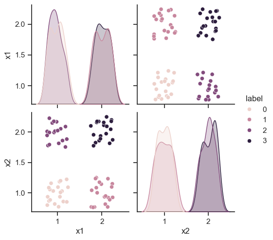
sns.pairplot(df, hue="label")
<seaborn.axisgrid.PairGrid at 0x199c18eafd0>
Show code cell source
# proyecciones
p1  = []
vR1 = np.array((1,1))
iR1 = np.inner(vR1,vR1)

p2 = []
vR2 = np.array((1,-1))
iR2 = np.inner(vR2,vR2)

for ii in df.index:
    v = np.array((df.loc[ii,'x1'],df.loc[ii,'x2']))
    p1.append(np.inner(v,vR1)/iR1)
    p2.append(np.inner(v,vR2)/iR2)

df['p1']  = p1
df['p2']  = p2
df.head()
Show code cell output
| x1 | x2 | label | p1 | p2 | |
|---|---|---|---|---|---|
| 0 | 1.056981 | 0.935569 | 0 | 0.996275 | 0.060706 |
| 1 | 0.781720 | 0.935267 | 0 | 0.858494 | -0.076773 |
| 2 | 0.810779 | 0.867002 | 0 | 0.838890 | -0.028112 |
| 3 | 0.906029 | 1.030259 | 0 | 0.968144 | -0.062115 |
| 4 | 1.103518 | 1.027526 | 0 | 1.065522 | 0.037996 |
Show code cell source
colorsDict = {0:'orange',
              1:'red',
              2:'green',
              3:'blue'}
colores = [colorsDict[df.label.loc[i]] for i in df.index]
f,ax=plt.subplots(nrows=1,ncols=2,figsize=(20,10))
ax[0].scatter(df.x1,df.x2,c=colores,alpha=0.5)
ax[0].scatter(np.zeros(df.shape[0]),df.x2,marker='<',c=colores,alpha=0.5)
ax[0].scatter(df.x1,np.zeros(df.shape[0]),marker='v',c=colores,alpha=0.5)
ax[0].set_xlim((-0.5,3))
ax[0].set_ylim((-0.5,3))
ax[0].grid()

ax[1].scatter(df.x1,df.x2,c=colores,alpha=0.5)
ax[1].plot(np.linspace(-0,3,100),np.linspace(-0,3,100))
ax[1].plot(np.linspace(-3,3,100),-np.linspace(-3,3,100))
ax[1].scatter(df.p1,df.p1,marker = '+',c=colores,alpha=0.5)
ax[1].scatter(df.p2,-df.p2,marker = '+',c=colores,alpha=0.5)
ax[1].set_xlim((-1,3))
ax[1].set_ylim((-1,3))
ax[1].grid()
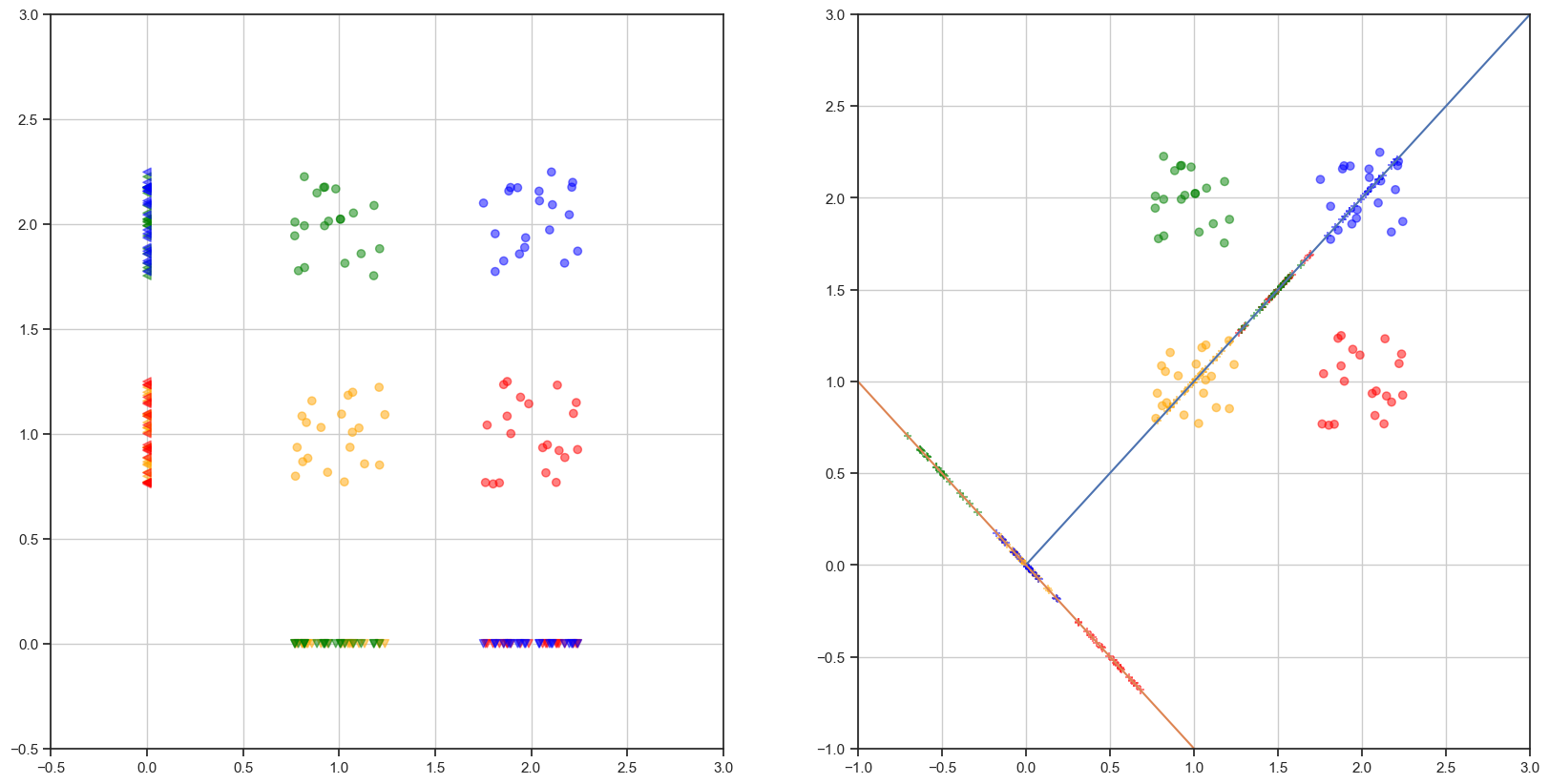
Nota: existen direcciones para las cuales las proyecciones son más adecuadas
Mapa#

Fig. 26 Mapa de Madrid#
Un mapa es una proyección cartográfica en la que puntos geográficos cercanos están cerca en el mapa.